User Experience Testing – Intern Placement Programme

 Why usability and user experience testing is a crucial part of building a website


Here at No Pork Pies we believe that usability and user experience testing is a crucial part of building a website. We always run our own user tests to find out how users are interacting with our client’s websites to help us find any issues that may make them difficult to use.

The importance of this type of testing varies depending on the size and complexity of the site but as a minimum we like to test a site with at least five users. This is based loosely around Nielson’s findings that indicate that five users will generally uncover over 80 of problems and also based on our own experiences of testing with different numbers.
Number of tests required
The type of website may also have an impact on the testing we undertake. For example, a small ‘brochure’ website may only require some quick tests to see if the site is clear and easy to read but other sites with high levels of functionality will require more detailed testing.
This blog post looks specifically at some recent testing that we ran for The Wired Sussex Intern Placement Programme site. A site aimed at matching young job seekers with six week placements in the digital media industry.

Case study – Wired Sussex Intern Placement Programme

Wired Sussex supports the development of digital media companies in and around Brighton. They deliver a wide range of services, initiatives and networks designed to help their Members develop their businesses. To help their members recruit the best local talent Wired Sussex have been running internship programmes since 2007. During 2014 they plan to help local companies take on over 150 interns as part of a funded and managed placement programme. To help achieve this goal Wired Sussex wanted to create a website where job seekers could apply for internships.

No Pork Pies were involved with the development of the site, working closely with Devour Design and developers from TGSi. We were also responsible for testing the site with real users to ensure that it worked for them prior to launch.

Who Took Part?

It was important that we ran the tests with users who were representative of the people who would be using the final site. This meant that we recruited job seekers who were looking for a first job in the industry. We aimed for a mix of male and female testers as well as testers looking for different types of digital role, i.e. programmers, designers, SEOs etc. We managed to get a good range of testers from different backgrounds to take part in the initial tests running individual testing sessions with five different users.

How did it work?

The test we put together for our sessions was made up of three parts. The first thing we asked users to do, after making them a nice cup of tea, was to look at the site for just 10 seconds. After they’d had this quick look at the new site we asked them a few questions about it. These included things like:
  • What is the website about?
  • Who is it for?
  • What type of internships are being advertised here?
  • Do you remember any details about the internships?
  • Do you think you might use this website?
The idea behind these questions was to see how much information was taken in by the users on a first glance of the site. Users are notoriously impatient and we know that the website needed to get some key points across quickly to keep their attention.
The next part of the test was to get our participants using the site. They were given a series of tasks to undertake to see how easy it was for them to complete some of the key actions. It’s important with this type of testing that you don’t lead your users too much. Keeping their actions as natural as possible will yield better results than giving them strict step-by-step instructions. For example, it’s better to say to someone “have a look for an internship that you might be interested in” than to say “search for a programming internship”. The first example is better as it not only allows the user to act in a more natural manner (a designer wouldn’t search for a programming internship for example) but the more open-ended wording is less leading than using a word like ‘search’.

This section of the test was ordered in a similar way to how we would expect people to use the website for the first time. So, we started off by asking our users to find out more about the scheme before encouraging them to register and apply for internships. We made notes during these tests to keep track of what was happening and also gave each task a rating of how difficult each user found it (more on this in the results section).

After our users had completed the task-based section of the test we then asked them some more general questions about how they had found the site. This was to give us an idea of whether they had found it easy to use, whether it contained all the information and functionality that they required and also whether there were any additional comments or ideas that they had.

Results

The following is a quick overview of the test results; these cover the main points that were learned during testing.

Ten Second Test

The first ‘ten second test’ undertaken by our users gave some interesting results. Users quickly spotted the strapline of the scheme “can’t get a job without experience, can’t get experience without a job” and felt that this was a situation that they could relate to. They quickly identified that the website was about internships and most of the users also were able to say that the internships were for digital media roles. However, only one of the testers was able to identify key details about the internships such as the duration and pay.

Listen to some of the users talking about their first impression of the website:

Tasks

The tasks section of the test showed that our users found undertaking most of the main actions on the site fairly straight forward. There were some standout issues though as the graph below shows:
User Test Results
As the graph shows, task eight was the most difficult for the users. This was where they had to find Intern Mentors on the site and they struggled with this due to the positioning of the Mentors page. The first task also proved to be harder than expected for the group with most of the users finding out basic information on internships but struggling to find some of the other details. None of the other tasks posed major difficulties for our users, but there was still room for improvement with a few of them.

Final Questions

The final part of the test where users were asked their opinions on the site also gave some useful feedback. All five of the users said that they found the site easy to use and in general they were positive about the overall design. This area of discussion gave some additional ideas for improvements that could make the site even better for future users.

Changes

As the test showed, the main areas for concern were around finding out more about the scheme and finding the Intern Mentors. These issues have been resolved by making both the FAQs page and the Mentors section more prominent across the site.
Wired Sussex Changes
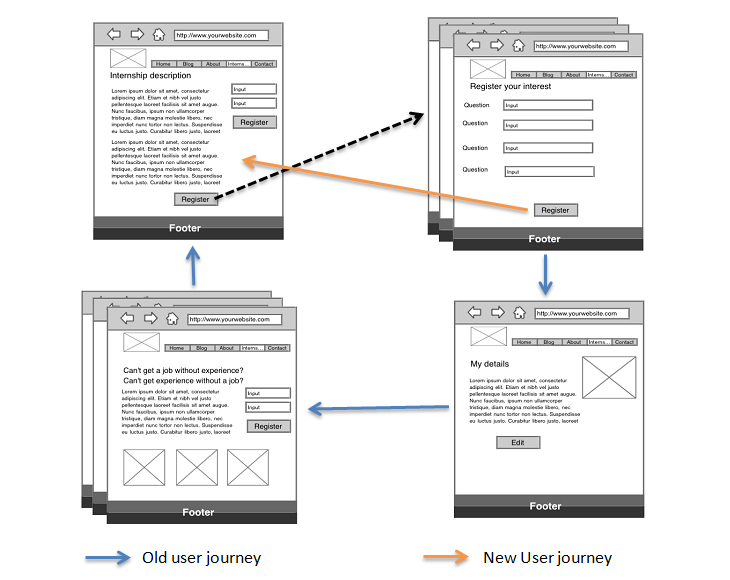
Other changes were made to make the registration and application process smoother. Users who register while on a specific internship originally got taken to the My Details page as soon as they had successfully registered. This is fairly standard practice but our tests showed that users would get confused as they next step they wanted to take after registering was to apply for the internship. Instead they had to navigate through several pages to get back to where they wanted to be. To ensure this was not the case we changed the user journey so that anyone registering on a specific internship was returned directly to that internship rather than shown the My Details page.
Wire Frames
There were also a couple of small issues with the form fields for the application process. Some of the users were confused by being asked for their LinkedIn profile. Firstly, most of the users will have little or no work experience so may not have a LinkedIn profile, and may not have even heard of LinkedIn. Secondly, there was some confusion about what to put in this box. Do users put in their full profile address (http://www.linkedin.com/in/hayluke) or just the end bit (/hayluke)? To solve this we decided to remove the field entirely after speaking with Wired Sussex. They had no real plans for the data so it was agreed that it should be left off.

The other minor change was to alter the labelling of the Twitter field. This was because sometimes people write their twitter address with an ‘@’, some with a ‘/’ and some with the full address. The simple solution here was to include the ‘@’ prior to the field on the form.
Twitter handle
Other changes that we recommended included:
  • Remove filtering options when there are few internships in the search results
  • Add a list of Latest Internships to the homepage
  • Allow Open Office files to be uploaded as CVs
…and a few other minor points that we thought would improve the process having watched several users perform the main actions on the site.

Measurement

We shared the results of the tests with Wired Sussex but it was also important for us to help them measure the ongoing success of the site. We were confident that after making changes based on the test results the site would be easy to use, but we wanted to ensure that the applications were coming in and where improvements could be made.

We set up some Goals in Google Analytics to measure both registrations and applications on the site. We then set up custom reports so Wired Sussex could quickly see where applications were coming from and which internships were proving to be popular.
Google Analytics Measurement
Providing these simple reports to Wired Sussex means they can quickly see the success of referring sites and also spot any internships that are underperforming.

Summary

These tests gave us some real insights into how people use the website. Most of the issues that our users came across were resolved quickly and easily with minimal additional work but they will have led to a much better user experience. This has been backed up by the fact that there have been over 200 applications for internships within the first two weeks of the site launching.

Without doing these tests on the live site it is impossible to know how much time and frustration has been saved, and also whether this has had a direct impact on the number and quality of applications for internships. However, we can be very confident that the issues that our test group were having will have been reduced due to the changes to the site. These issues may have reflected badly on Wired Sussex as an organisation and they may also have reflected badly on the Placement Programme overall. We can now be confident that all of the main actions that interns need to take on the website can be undertaken quickly and efficiently.

Even the sections of the test that our users found easy were also useful despite the fact that they didn’t lead to any changes on the site. Wired Sussex can be confident that these tasks can be performed with few problems by most users and they will have fewer concerns about people using the site.

SHARE THIS PAGE!

more reading...