Client Need
Wired Sussex required a site that would fit well with their existing online presence whilst maximising usability. Working closely with Devour Design and developers from TGSi, we conducted usability and user experience testing to ensure each visitor found the process as intuitive and informative as possible.
Challenges
Typical job-hunters and prospective interns are often faced with dozens of application forms and varying processes throughout their search. It was important that the application for the Wired Sussex Intern Placement Programme was frictionless, self-explanatory and encouraging.
In addition to this, the site was to serve as an information resource for companies considering taking on an intern; to showcase the benefits that an intern could bring to their business.
The Solution
To begin with we worked closely with the designer and developer to create an engaging user experience. This involved creating wireframes prior to the design phase and working with the developer to ensure that the application process was as smooth as possible.
Before the new site went live we conducted extensive user tests to identify and correct any stumbling blocks within the conversion funnel. Firstly, we recruited job seekers who were looking for their first job in the industry. Then we conducted a test, comprising of three parts:
Ten second impression
After looking at the site for 10 seconds; what impression is the user left with? What does the user perceive as the site’s purpose and target audience? What details can the user recall?
Key actions usability
How intuitive or otherwise did the user find the central tasks involved in navigating the application process? Were there stages which prompted confusion or hesitation?
Questions/Debrief
Gathering feedback about overall experience, ease of use, functionality and availability of information. we also noted any additional comments or ideas they had.
Using this process we was able to identify some usability hiccups along the conversion funnel and correct them to ensure optimum user experience.
The Result
The test showed the main areas of concern were around finding out more about the scheme and finding the Intern Mentors. These issues were resolved by making both the FAQs page and the Mentors section more prominent across the site.
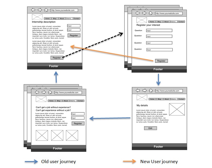
Other changes were made to make the registration and application process smoother. Users who register while on a specific internship originally got taken to the My Details page as soon as they had successfully registered. This is fairly standard practice but our tests showed that users would get confused as the next step they wanted to take after registering was to apply for the internship. Instead they had to navigate through several pages to get back to where they wanted to be. To ensure this was not the case we changed the user journey so that anyone registering on a specific internship was returned directly to that internship rather than shown the My Details page.

Other tweaks includes:
- Changing the social media profile links to clarify exactly which details were required.
- Remove filtering options when there are few internships in the search results.
- Add a list of Latest Internships to the homepage.
- Allow Open Office files to be uploaded as CVs.
- A few other minor points that we thought would improve the process having watched several users perform the main actions on the site.
Client Story
Wired Sussex supports the development of digital media companies in and around Brighton. They deliver a wide range of services, initiatives and networks designed to help their members develop their businesses. To help their members recruit the best local talent, Wired Sussex have been running internship programmes since 2007. During 2014 they plan to help local companies take on over 150 interns as part of a funded and managed placement programme. To achieve this goal Wired Sussex wanted to create a website where job seekers could apply for internships.


